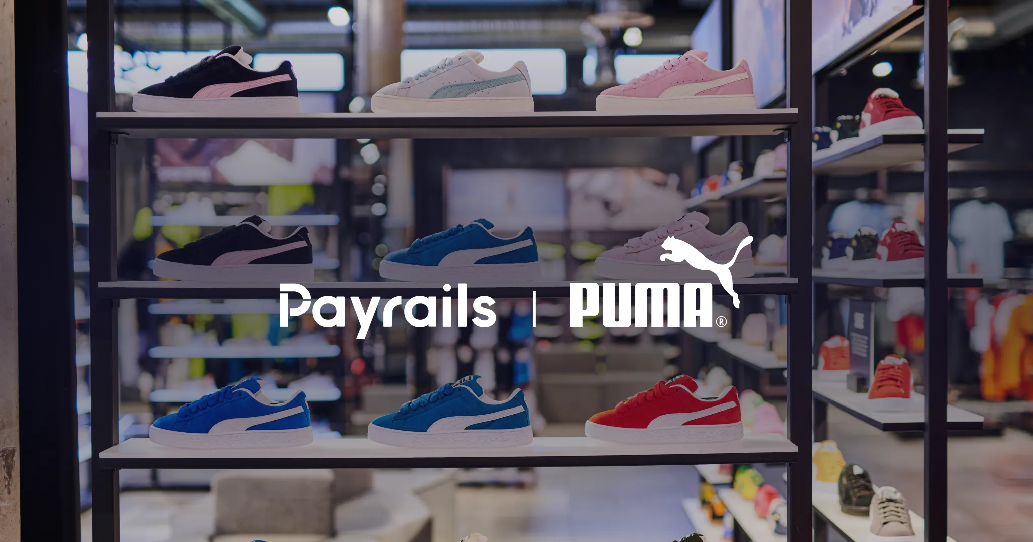
I joined Payrails in August 2025. At that point, the company was already doing a lot right. We had strong products, impressive customers, and a team building genuinely ambitious infrastructure.
The brand, meanwhile, had been slowly evolving. Each LinkedIn post, each white paper, each campaign nudged it forward. But that evolution was largely reactive. We were aligning ourselves to industry trends, competitor patterns, and the loudest players in the space, rather than anchoring to our own core.
It became clear very quickly that this was not a problem a great campaign could solve.
If we wanted to truly separate ourselves from competitors and peers, we needed more than polish. We needed foundations anchored in our goals and aspirations. And not just brand foundations. This was a category shift.
What we were building as a company had outgrown the way we were presenting ourselves. The brand needed to move in step with product strategy.
I think of this less as a rebrand, and more as a company wide reinvention.
A strategic turning point
Early conversations with Orkhan and Emre reinforced that timing mattered. This was not happening in isolation. The business itself was entering a new phase.
We were narrowing our focus on enterprise. Our ambitions were getting bigger. The complexity of the problems we wanted to own was increasing.
We needed a brand that reflected where we were headed, who we wanted to be, and how we planned to get there.
We also had a strong point of view on what we did not want to be. We did not want traditional finance brand speak. We see finance as an operating system, not a static function. That mindset needed to show up in how we look, how we speak, and how we design.
We had the vision. We had C-level backing. What we needed next was execution, with an ambitious 3.5 month zero to launch timeline.
Looking back before moving forward
I started at the origin story.
The previous Payrails brand was rooted in modularity. That was a real and important truth. But over time, modularity had become the only story we were telling.
The identity leaned heavily on a grid-like P, often expressed through visuals that stacked or built components. It spoke to building blocks and modularity. Meanwhile, the actual Payrails offering had grown far beyond modular payment solutions. The brand needed to move beyond assembly and show that it could grow, scale, and expand.
The name itself gave us a bigger clue. Rails are not just modules. They are infrastructure. They are directional. They carry flow, scale, and momentum.
The brand needed to expand from a single USP into a system that could express the full scope of the product and the ambition behind it.
Listening across the company
From there, I wanted to pressure test my assumptions. So I talked to people across the business.
I sent surveys. I booked interviews. I spoke with people who had joined recently, like me, and could offer fresh perspective. I also spoke with team members who had been there from the beginning and had lived every iteration of Payrails’ evolution.
Clear patterns emerged.
- Messaging felt inconsistent, and the visual language still carried a startup vibe
- Leaning into finance blue left us lost at sea among competitors
- We lacked governance and consistency. There were no clear design rules
- We needed to increase trust and credibility without becoming corporate or generic
This was the tension point.
On one side, we needed authority, trust, and enterprise credibility. On the other, we could not afford to blend in or lose the edge that made Payrails different in the first place.
Getting this wrong would mean choosing safety over clarity. Or personality over credibility.
The challenge was to do both.
Evolving our design principles
These insights became the starting point for deep exploration inside the design team. Through workshops, experiments, and a lot of exploration, connections started to form.
The goal of our design principles was simple. Create a shared decision making framework that could guide every design choice, across brand, product, and marketing.
Here is where we landed.
1. Modularity as a system, not a surface
We leaned into Swiss grid systems where alignment becomes the aesthetic.
This gives us layouts that reflow cleanly across contexts, from website to decks to dashboards. It standardizes rules so any team can assemble assets with speed, without breaking the system.
2. Human experts building infrastructure for people
Our foundation is dark and neutral to signal seriousness and trust. Accents of warm orange bring human energy and action. Electric blue adds precision and technical confidence.
The result is a brand that looks like an expert and speaks like a partner.
3. Authority through restraint
We design like the category authority we aim to be.
Bold compositions, simplified layouts, and one dominant message at a time. Less ornament, more structure. Quiet confidence over noise.
4. Growth, movement, and modernism
Growth is organic. Our foundation is flexible.
This informed our motion language and visual themes. Subtle, purposeful movement. Horizontal transitions. Expanding frames, flow lines, connectors, and progressive layers.
5. Clarity over cleverness
Labels beat metaphors. Information comes first.
Swiss typography and restrained color palettes read as objective and unbiased, which mirrors our vendor-agnostic stance. We are here to make your stack work, without agenda.
The system comes together
With the principles in place, the system could take shape.
We carried forward our heritage Payrails blue as an homage to where we have been. Typography shifted from Mulish to Archivo for its cleanliness, readability, and objectivity.
Our color system became bolder, more digital-first, more accessible, and more extensible. Orange was introduced as a strategic differentiator. Gradients began to feel like flows and rails in motion, paired with inky charcoal, electric blue, and warm neutrals.
The logo rails themselves evolved into more than a symbol of payments moving. They became a metaphor for direction, momentum, and possibility. A single concept that the entire identity system could hang on and scale from.
Just as importantly, the system gave us something invaluable.
Constraints.
Clear decisions became a design tool. Something to say no to. Something that allows the brand to grow without losing itself.
A brand built to scale with us
This rebrand was about building a brand that could scale with our product, our ambitions, and our customers. One that supports Payrails as finance infrastructure, not finance decoration.
As the work progressed, the impact started showing up across the company. Sales became one of our most important sounding boards throughout the process. We shared early exploration decks openly, using their reactions as a real test of clarity and confidence. When decks started coming back with genuine excitement, we knew the brand was landing in the real world, not just inside design reviews.
That validation mattered. We wanted a brand the sales team would be proud to put in front of customers. One that made handing over the next one pager feel easy, confident, and energizing.
The system also began to unlock momentum beyond go-to-market. Marketing can operate with clearer guardrails and faster execution. Product have a visual language that matches the sophistication of what we are building. Our People team has a stronger foundation to align internal initiatives and tell a consistent story about who we are, what we value, and where we’re going.
We now have a system that is opinionated, extensible, and grounded in who we are. A brand that reflects where we are going, not just where we started.
And most importantly, a foundation strong enough to support the next phase of Payrails for years to come.

I am the text that will be copied.